1. To the Point
A few well-chosen words are better than long, babbly paragraphs, especially on mobile pages.
"Always make a point of deleting words and/or phrases that don’t add meaning to the marketing messages you’re trying to convey".
Note: The English language is riddled with useless words. In particular, sentences containing “that,” “which” and “who” can often be reworked and written more concisely.
2. Don’t Use Intensifiers And Superlatives
I mention this point specifically because it’s the most common mistake I see in Web and mobile copy. For some reason, folks think that adding vague words like “best,” “better” and “totally” makes for good marketing copy.
“Totally innovative company”
“Best product on the market”
What exactly is a “totally” innovative company? By what standard is your product the “best?” It’s far better to be clear, direct and descriptive than to litter your site with vague and meaningless language. Companies that win specifically and concisely spell out their benefits and advantages.
3. Use Bullets
Use bullet points on both mobile devices and regular landing pages. They are easy to read, communicate marketing messages effectively, and specifically hone in on customer wants/needs.
Because of how they’re structured, bullet points generally create more white space (as compared to paragraphs), so pages are less cluttered. Less text with more white space is important — this reduces cognitive load and allows visitors to make buying decisions more easily. For me, winning pages have between three and five bullet points per page.
4. Legibility Is Key
The font on mobile pages and buttons should be large enough for people to read without having to zoom in. Mobile buttons should be large & easy to click so that visitors can take action quickly.
For extra ease of use, clickable information should be tied to your primary conversion event. An example is having a click-to-call phone number to drive phone calls for people to make appointments or purchase something via phone.
5. Have A Simple Form
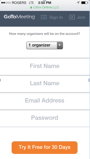
Mobile forms should include no more than three or four fields and a clear call-to-action. If needed, include other info farther down the page. Take a look at the following example:
6. Fast Loading Pages
It goes without saying that fast loading pages are important. I like pages that load under five seconds, but the faster the better. Among other reasons, people are using their phones while multitasking or between tasks.
7. One Solid Call-To-Action
Don’t distract or confuse visitors with more than one call-to-action — instead, focus your landing page on just one.
If you absolutely must have more than one, have your main call-to-action clearly visible and accessible to the user at the top of the page and secondary conversions (like “learn more” or an app download) farther down the page.
With B2B businesses, it’s a slightly different story. No other conversion points should appear on a page besides the main call-to-action. Don’t suggest additional products like B2C companies (a la Zappos). Conversion suffers if there’s more than a single call to action on the page.
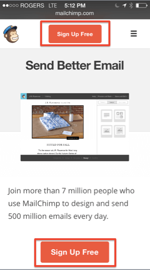
Incorporating benefits into buttons is also a winning strategy. In the above example, GoToMeeting’s call-to-action button reads, “Try it Free for 30 Days.” In the example below, MailChimp has the same call-to-action appearing twice on the page, and they use the word “free” in their button.
Your call-to-action can also be a phone number (if applicable to your business). Phone calls tend to convert much better than online conversions anyway, as per my article on phone conversions. If your business can go either way, running a phone number on mobile pages is an awesome test.
 Your call-to-action can also be a phone number (if applicable to your business). Phone calls tend to convert much better than online conversions anyway, as per my article on phone conversions. If your business can go either way, running a phone number on mobile pages is an awesome test.
Post a Comment